-
 A logo for a company which produces unique clothing and toys for children. The client wanted a logo
that is simple, bright, and fun, but also elegant.
A logo for a company which produces unique clothing and toys for children. The client wanted a logo
that is simple, bright, and fun, but also elegant.
-
 This company develops 3D virtual tours. These are useful for residential and commercial real estate
listings, as well as for a variety of other applications. Check out
their website.
This company develops 3D virtual tours. These are useful for residential and commercial real estate
listings, as well as for a variety of other applications. Check out
their website.
-
 This stylish logo is for a company that designs, prints, and installs bespoke wall murals
and wallpaper.
This stylish logo is for a company that designs, prints, and installs bespoke wall murals
and wallpaper.
-
 This client produces artisanal sweets and chocolates. The candy canes are a subtle visual metaphor
for the Chicago skyline.
This client produces artisanal sweets and chocolates. The candy canes are a subtle visual metaphor
for the Chicago skyline.
-
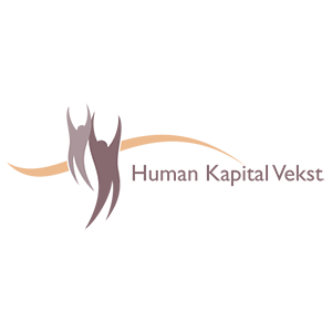 This design was for a human resources company in Sweden. I quite like the calming effect of the
flowing curves and warm, earthy colours.
This design was for a human resources company in Sweden. I quite like the calming effect of the
flowing curves and warm, earthy colours.
-
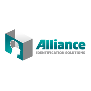 This client specialises in various kinds of commercial identification systems. This was my favourite
logo concept, although the client chose a different option, which can be viewed on
their website.
This client specialises in various kinds of commercial identification systems. This was my favourite
logo concept, although the client chose a different option, which can be viewed on
their website.
-
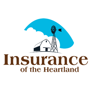 This design was for an insurance firm in Nebraska. They offer farming insurance (in addition to several
other types of insurance cover), and wanted to have the rural image of the barn and windmill presented in a
clean and formal context. I was partial to this layout, but the client chose a slightly modified variation
as their final logo.
This design was for an insurance firm in Nebraska. They offer farming insurance (in addition to several
other types of insurance cover), and wanted to have the rural image of the barn and windmill presented in a
clean and formal context. I was partial to this layout, but the client chose a slightly modified variation
as their final logo.
-
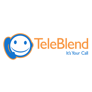 TeleBlend is a VoIP (Internet) phone service provider. Blue and orange is a wise colour choice in a
case like this; it’s a classic combination for phone services and telecommunications.
TeleBlend is a VoIP (Internet) phone service provider. Blue and orange is a wise colour choice in a
case like this; it’s a classic combination for phone services and telecommunications.
-
 This is a company based in China, which constructs industrial buildings—such as laboratories and
factories—in many parts of the world.
This is a company based in China, which constructs industrial buildings—such as laboratories and
factories—in many parts of the world.
-
 This is a logo for a Crossfit gym in Florida. I chose a more stylised variation to display here,
but the option which the client chose is also great—have a look at it on
their website.
This is a logo for a Crossfit gym in Florida. I chose a more stylised variation to display here,
but the option which the client chose is also great—have a look at it on
their website.
-
 This company produces server computer racks and cabinets. Here›s
their website
(the logo they're currently using is also one of my designs.
This company produces server computer racks and cabinets. Here›s
their website
(the logo they're currently using is also one of my designs.
-
 Financial advisers, a husband & wife team operating out of Western Australia. The logo image contains
a subtle, stylised letter “F”.
Financial advisers, a husband & wife team operating out of Western Australia. The logo image contains
a subtle, stylised letter “F”.
-
 This client wanted an elegant design, with a logo drawing that would only “hint at”
an image of an eagle. I think the end result is quite striking.
This client wanted an elegant design, with a logo drawing that would only “hint at”
an image of an eagle. I think the end result is quite striking.
-
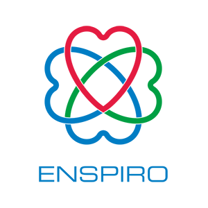 This is a company in Sweden delivering medical care and pharmaceutical products. The image of
interlocking hearts signifies the various different types of care and treatment comprised in their
service.
This is a company in Sweden delivering medical care and pharmaceutical products. The image of
interlocking hearts signifies the various different types of care and treatment comprised in their
service.
-
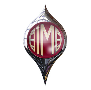 This was a refreshing change from the print-focussed work that I do most often. The client specialises in
classic cars, and wanted a logo in the style of a vintage car’s badge. The “IM” in
the design is for the company name, International Motorcars.
This was a refreshing change from the print-focussed work that I do most often. The client specialises in
classic cars, and wanted a logo in the style of a vintage car’s badge. The “IM” in
the design is for the company name, International Motorcars.